
Cannajoy is simple, from the all-natural ingredients we use, to the ease of an online purchase. We believe in products that convey our mission, encouraging a world filled with more wellness, less pain, and a better quality of life — all through CBD.
For this rebranding project, we created the brand identity and packaging with a friendly and minimalistic approach, projecting positivity and vitality.
↓
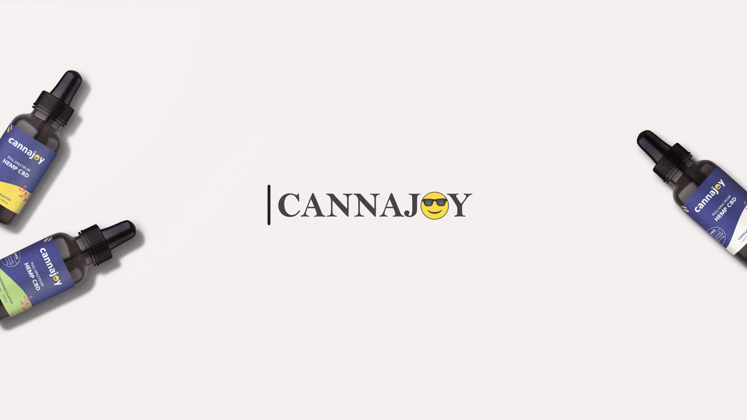
logo
Like the name, we want the design to convey the feeling of joy and simplicity whilst encapsulating a premium feel. I updated the logotype with a fresh geometric sans serif font along side a cheerful silhouette of a smiley face. By keeping it all lowercase, the logo appears more casual, approachable and lighthearted.
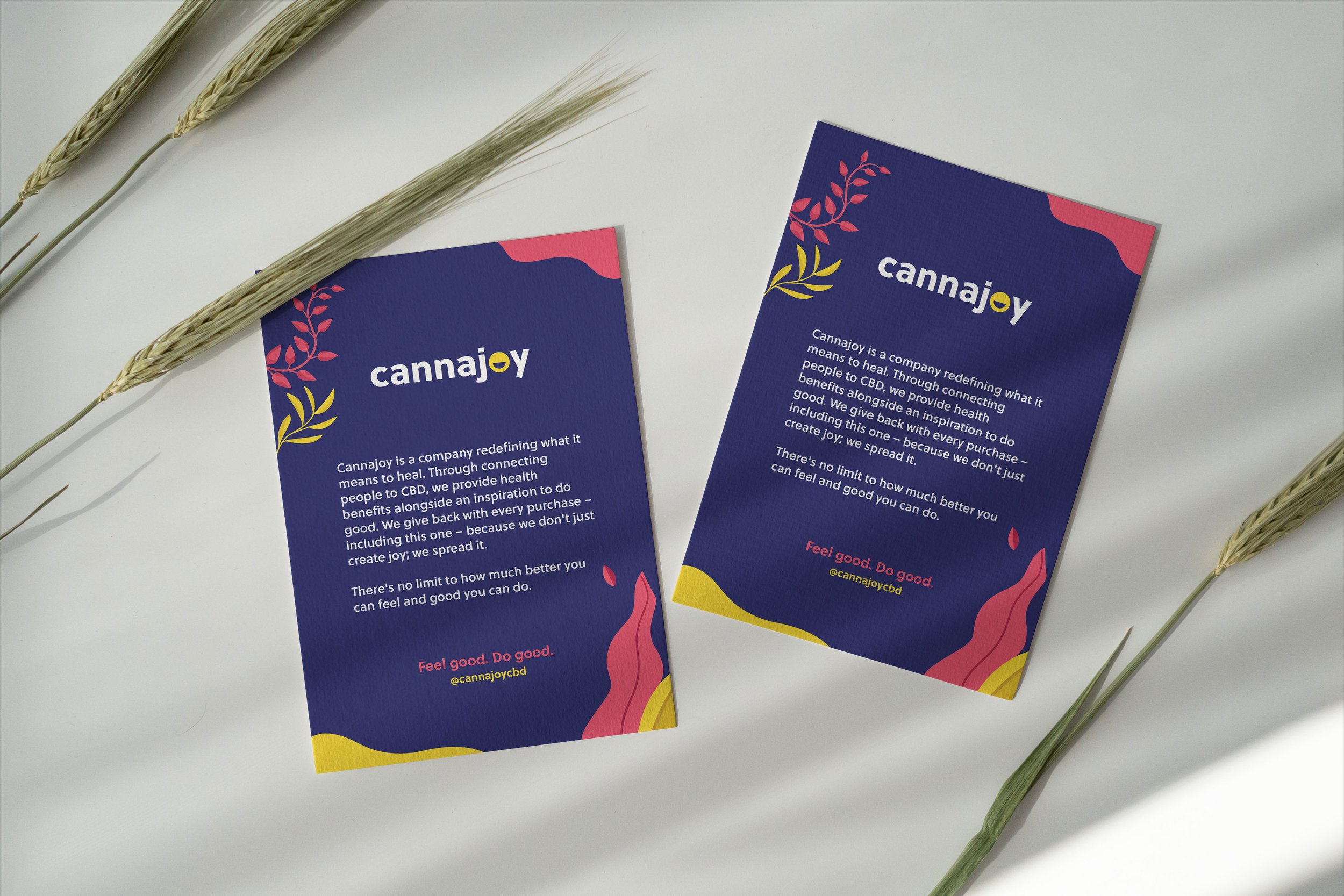
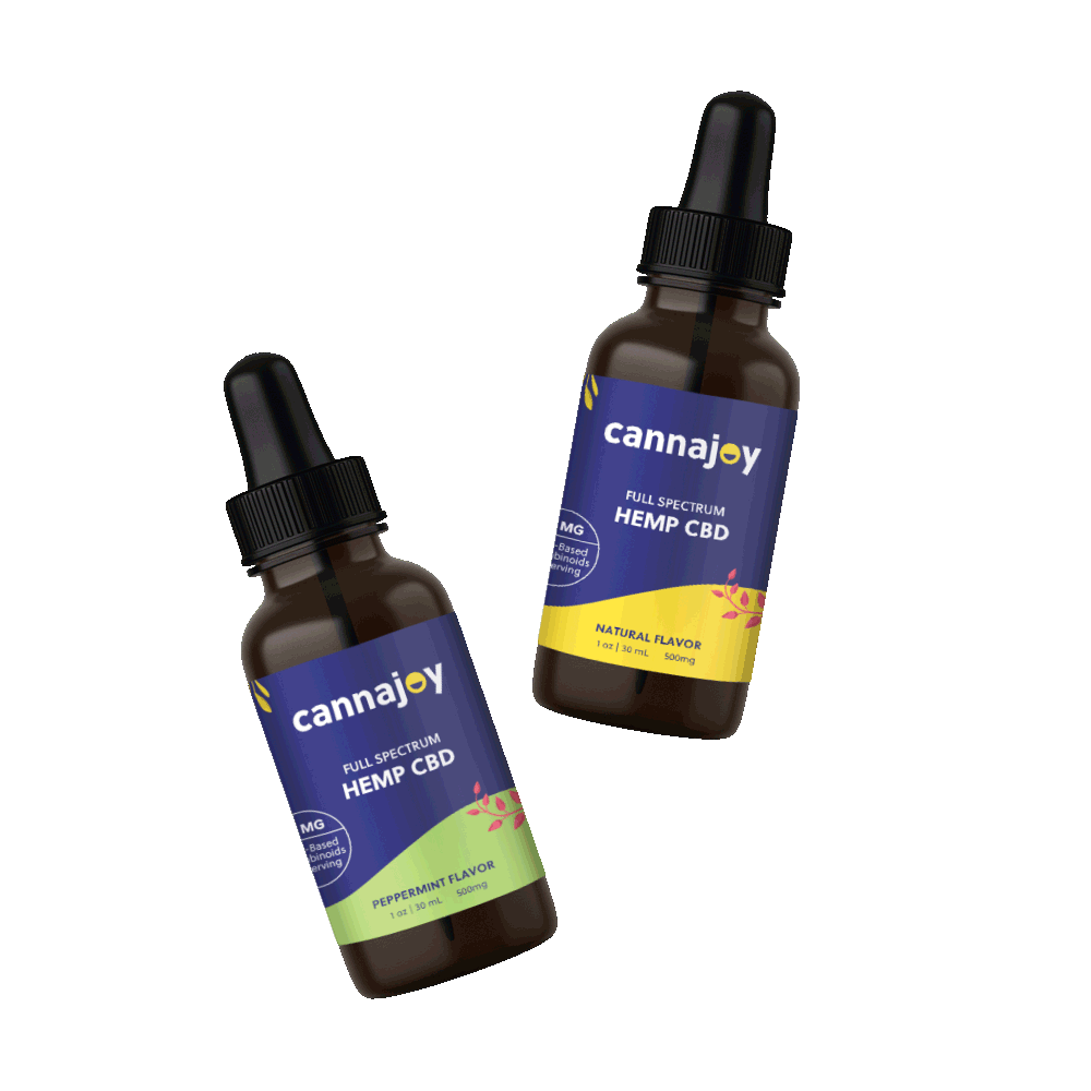
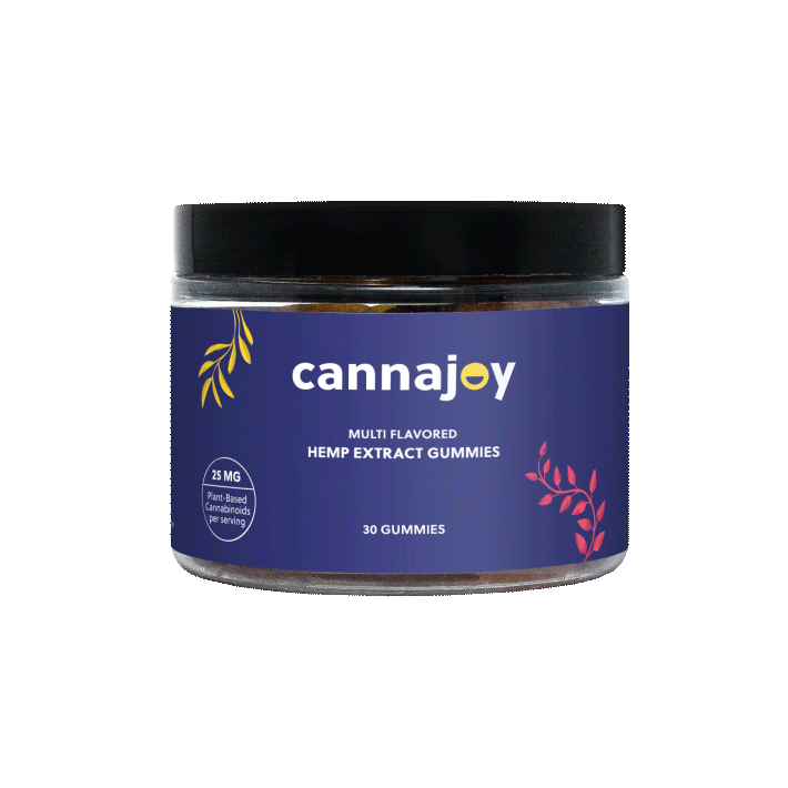
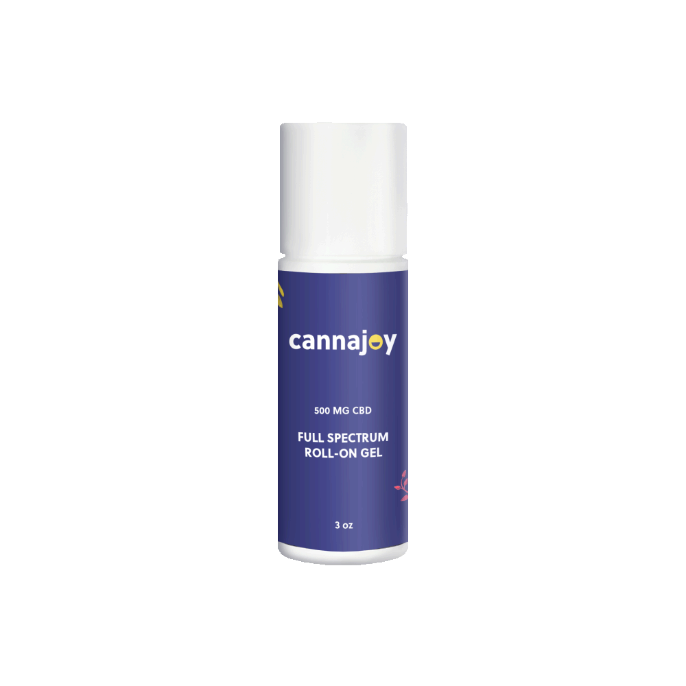
packaging
The goal is to create a visual identity that encapsulates the product’s promise. Adding the illustrated wavy elements into the label design, we want to convey the organic nature of the brand with a hint of flair.

The color palette gives the packaging a positive and yet functional character that seeks to evoke emotion beyond joy. Each color chosen to create the distinction between the flavors of the products.

I also designed a different set of labels for Cannajoy’s CBD pet treats to distinguish it from the other products. The cat and dog smiley face silhouettes reflect the one in our logo, because we also want to bring smiles on our pets’ faces. The icon set also allow consumers to easily and quickly gain product information.


web design
+ motion graphics
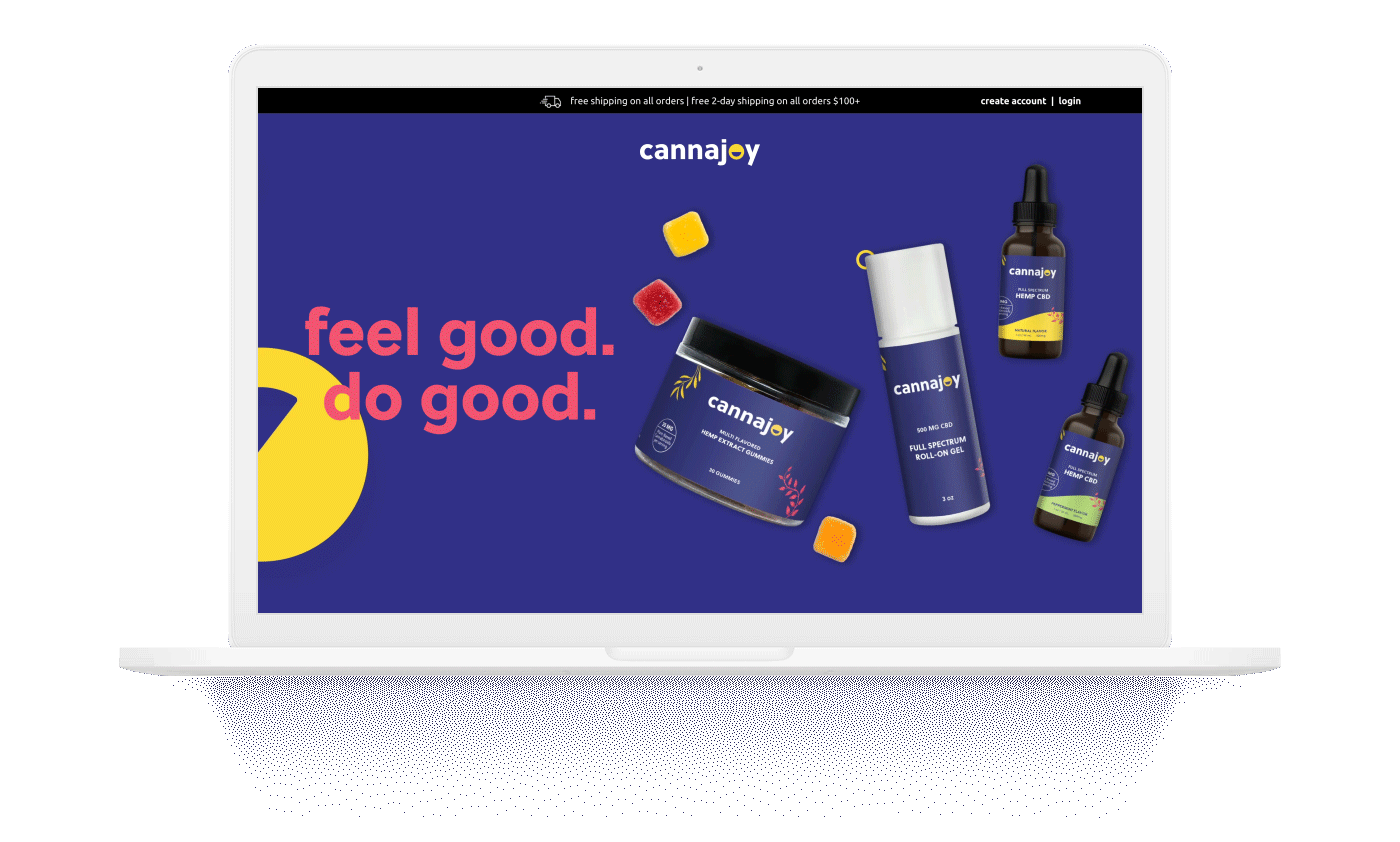
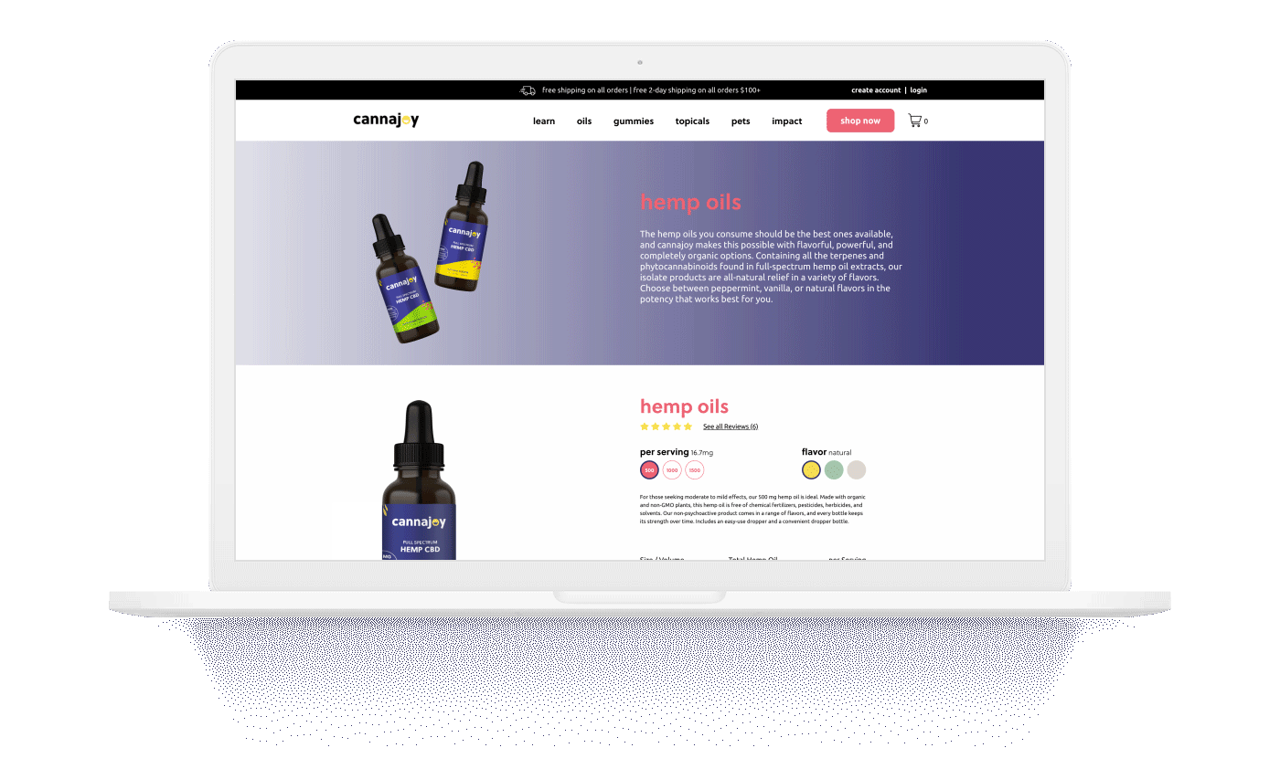
Another application of the new brand was designing the Cannajoy website. We wanted to design a website that catches attention and stands out in a sea of sameness.
I specifically designed a brand new set of icons and motion graphic elements for the new e-commerce platform. The goal is to showcase these organic products in a playful and animated way. The animations encapsulates joy, adding relatability, clarity and emotion. We also used the same elements across all marketing platforms for Cannajoy’s brand, further strengthening its brand identity.
With the web redesign launched and new creative out in market, Cannajoy’s sales have steadily increased and the website has driven more conversions by a significant factor.


social media marketing
To generate content for Cannajoy’s website and social media presence, we creative directed gorgeous outdoor product shoot to capture the natural and organic aesthetic of the brand.
In addition to lifestyle photography, we also incorporated motion graphics into our marketing to make us stand out. The objective is not only to promote, and also to educate the consumers about the use of CBD products. With informative graphics and smooth animations, Cannajoy bring charisma and inclusiveness to an audience with different levels of knowledge about the nature of these products.


Client: Cannajoy
Agency: NOMAD DV
Branding & Design: Bessie Yang
Copywriter: Jen Merritt
Animation: Bessie Yang